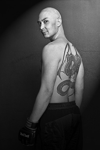
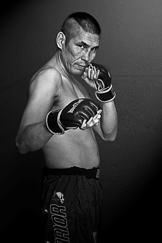
Luckily there wasn't really much pressure, they just needed 2 shots evenly lit at 300dpi so they could send them off to the event organizers for posters. I didn't even have to edit any of them.
Thank god I discovered the Strobist blog, if I hadn't I would not have had a portable rig to pull this off with let alone the lighting skills to setup, shoot, and tear down in 30min. After work I sped home and grabbed two light stands, my 580EXII and 430EXII, my "poverty wizards" and two shoot thru umbrellas. All stuff I could carry on my own and load into the car in one trip. Portability rocks!
My friend had mentioned the gym is in a basement but that it was really well lit. Never trust the client's ability to guage lighting conditions. It was plenty bright enough for training etc but not for photos if I wanted to shoot at a high enough fstop to get detail and low enough ISO for tight grain.
I new they wanted these for promo posters so I wanted to keep the fighters fairly evenly lit so that they could be removed from the background if need be. I decided to go with my new-found favorite lighting setup "the clamshell" configuration. With this setup you have two umbrellas stacked vertically and you shoot through the gap in between. It essentially makes it look like the person was standing infront of a 9'x3' softbox.
The shots they needed were pretty dull as far as lighting goes so after burning the disc off I decided I'd edit two quickly just for the fun of it.
Since fighting is a harsh and violent sport I decided to pump up the clarity slider in Lightroom, something I normally don't do (too many amatures are trying to fake the "Dave Hill look" that way) however I felt in this circumstance it would work.
Once I got them into photoshop I needed to do something more dramatic with the lighting. Awhile back I read an article about the light renderer in PS and how it could actually be useful. I finally tried it on a few photos and it actually works pretty decently. For these I set a spotlight up on the top right shining down diagonally across the photo.
At this point I pretty much had the shot where I wanted it but I thought I'd try for a little more of an edge. I duplicated the layer and added a high pass filter to it dialed in just to enhance some of the fine edges, then set the layer blend to overlay. Its important to desaturate the hipass filter layer too because it tends to greatly amplify colour noise.
Voila, 2 poster quality shots with minimal editing all from a shoot that was 30min from setup to tear down. I know I could have done much better given more time and a licence to edit but it wasn't what the customer wanted. These two shots were just a fun bonus I later emailed to him incase they could use them.

Dave from "Way of the Dragon Martial Arts" based in Saskatoon

Elmer also from "Way of the Dragon Martial Arts" based in Saskatoon

2 comments:
Very nice James. I am never very good at pressure and tend to prefer to plan a shoot for a week or more in advance. But, setting up and tearing down takes me much much longer being in a wheelchair and all.
A comment I wanted to add was that I find interesting you should talk about the light rendering in Photoshop. A few weeks ago a friend of ours took some pictures of his pregnant wife and I was trying to deconstruct the photos including the lighting. I asked him if he was using pocket wizards or poverty wizards or a sync cord or simply the built-in cls of his Nikon flash. I also asked him what he used to restrict the light and thought that it looked like a snooted strobe. We really have not had much of a chance to discuss photography in the past I did know that he shoots Nikon.
He gave me this funny confused look and said, "Um... just the pop-up flash. I added the light from the top left with Photoshop."
All I could say was that it looked far more complicated than that.
Yeah I was surprised the first time I used it. Its still not a substitute for lighting it properly at time of capture but in a pinch in can save your a$$. I used it here because the client needed a basic shot with even lighting so they could remove the background later. That didn't leave me with an interesting shot so I started playing around and it worked out.
Post a Comment